Wednesday, April 17, 2019

Malcolm X

My memories of Malcolm X date back to when I was a kid. I distinctly remember the photograph of him with his pointed finger, and his assassination quite a topic of conversation years after the event in the decidedly racist neighborhood in Queens where I grew up.

I'd read bits and pieces of his autobiography over the years, but only recently in one hit, oddly, on a plane to Bogotá this January. The Times, in its review back then had called it a painful book, and it was. The stories are well known, and I'm not going into them here. Except one.

Something I found resonated with me: the passage where he described a time when he was in a foster home with a white family. He described social workers, neighbors and others coming over to view how he was getting along--as if this could be measured--in the foreign environment to which he had be relegated.

What struck me was that he, his situation and his details about his daily life were discussed and dissected plainly in front of him, without the first consideration that he participate or be included in the conversation, or that he had any understanding--or the ability to understand what was being said about him. He observed and felt that he was treated like a piece of property, like a piece of real estate or a farm animal.

By Any Means, digital typographic com-
position, 22 x 30 inches 56 x 76 cm.
I don't know if that's how all children were treated at the time, or if adults in that part of the US behave differently toward kids than liberals in Manhattan, but it resonated with me because I've seen this time and again with different individuals. The elderly, women, the differently-abled, foreigners, the poor. They're treated like specimens, in the worst sense of the word.

Making yourself prominent and respected on the most basic level of consideration, needs to be the springboard for any type of equality. That level of consideration could be quite complex, even at if it is elementary, and the exercise to explore, much less understand that consideration is a process that occurs over a period of time, on various levels and in an expanding network of ideas, cultural knowledge and historical facts.

Simply put, you don't wake up one day and understand "diversity". You don't get over "separate but equal" over night. We've been working on it for over a century and usually fail with a few pockets of success. However, what I find disheartening is when I see people who really ought to know better and have a sense of understanding and compassion, fall into what their insular circles have taught--and reinforced--over their lives. To the point that there isn't a chisel sharp enough or hard enough to break through the ice.

The piece shown was composed in AI and a number of design considerations were made to make the text readable. It's planned as a silkscreen, printed over the next few weeks.

Tuesday, April 16, 2019

Life Getting in the Way of Life

Very, very much time has passed without my writing, but that doesn't mean that I've set the project aside. Quite the opposite. The project has taken many new directions, and my research into print methods has been a journey that at once includes discovery and mourning as well.

It's almost impossible to get anything printed offset, unless, of course, you're a newspaper or magazine making thousands of impressions; the way to go nowadays is the INDIGO, which, out about ten years now, has pretty much replaced offset for anything other than web press applications (For those who don't know the term web press, it has nothing to do with the internet. It's a huge printing press, with six or more colors, and the capability to print both sides of a sheet in a single pass. The paper comes off huge rolls which are stored either at the press or a separate warehouse where the temperature is controlled. The printed sheets then go through a folding stage, and then brought by a conveyer belt to its end where it's made ready to bind. It's not the kind of press you can have in your garage).

Small runs of offset are non-existent. Funny, I used to be a quality control foreman in an offset printing plant, one of the few in Long Island City. We had some big perfecting sheet-fed perfecting presses but also, a little gem of a four-color mini-press, which I was hoping to find to print one of the pieces. To no avail. A few short years and this print method is dead, buried, dust.

The design work, however, has been ongoing--material being produced weekly from the goings on in Washington and all its ramifications. There are very disturbing trends that merit exposure, but the work must get out immediately. Like a printed periodical (ha!), if it doesn't get out, it's stale, old, and, as we've discovered by this administration, immediately supplanted by a new barrage of plainly weird news.


I wrote the copy for the piece above; sent it out to print digitally on Arches 88. Looks great. I might edition it and offer it for sale.

Additional posts coming this week, as a lot of the research is finally coming to fruition.

Tuesday, January 15, 2019

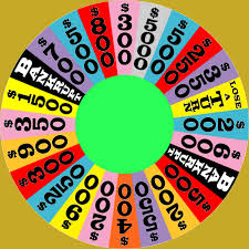
Rolex and the Wheel of Fortune

Has a nice ring to it, huh?

Both entities use Clarendon as their brand font. What's most interesting about Clarendon is that it can take on a circus quality (it's so thick and chummy) or it can have stability and command.

According to the site logorealm.com:

"Featuring a somewhat modified version of the Garamond typeface, the font in which the Rolex watches logo is written has gone through a few minor changes. These are mostly related to the serifs present in the font, as they have undergone several very minor changes over the course of logo’s existence."

Ex-cuse me!


Clarendon has NOTHING Garamond about it. The "changes related to the serifs" is a joke of a comment. Have a look at a Garamond R and the Clarendon R. 


The history of the wheel in the Wheel of Fortune is readily available on the Internet. However, what is interesting is that originally the wheel, designed by art director and Broadway set designer Edwin Flesh (1931-2011) was made of cardboard and lights. He brought lights and sound to the US TV game show; previous to that, the announcer used suspense like “what do you think is in this box?” But nothing more. 

Currently it’s steel and plexiglass, weighing 2,400 pounds, according to Sony Pictures, who currently owns the production.


Monday, June 11, 2018

Time flies.....

...when you're having fun.

Why talk politics when everyone else is doing it so much better than I ever could?

The revolving door to the White House has kept everyone on their toes while we ourselves tiptoe going on with life as usual. Fighting off the angst has turned commonplace. We'll breathe easier someday.

DSH has moved forward. No room for cynicism here. Two pieces are now for screen delivery; the tussle with my ego has made at least one bigger in size.

The morphing of the letterform is taking up my brain space. An E turning into an e. Or, an e turning into an E.

E Pluribus Unum.

Research shows that it has a few possible origins, from Cicero to a masthead item on a Revolutionary War period men's magazine. The idea was that one--a unity--could be crafted from many. Rather elegant for the time--far more than now, as we are caught wallowing in xenophobia.

But more simply, it's the makeup of all matter and endeavor. Out of many cells, one body. Out of many words, a statement. It's more than a building block; it's building blocks that unify into a structure.

None of this "every man for himself" stuff.

As I work on the e, 6H pencils and French curves build the pathway that I'll then import into Animate (or Premiere or Aftereffects--not sure which yet) and the motion will be built through one of the filters.

The hand work is needed for a smooth transition. Lowercase e turning into E is much harder than the other way around. I'll keep you posted.

From the pencil sketch, vector drawing.

Frederick Douglass

I had written this months ago; only posting it now. Sorry.

The president is ruining my blog.

Really. I'd been working diligently on my post about Frederick Douglass for a while--researching it to make sure there would be no fake news on it--and he goes out and proclaims him living. 

He should have boned up on Black history before slapping his name on the lease at 1600 Pennsylvania Avenue.  But he's not entirely to blame.

Growing up in a decidedly white neighborhood in Queens--one the other side of the tracks from where DJT was born--the name Frederick Douglass didn't enter my life as a child or teenager.  In the last three decades, sleepy Richmond Hill transformed itself into a more diverse neighborhood but back then, I knew about black people, slavery, and discrimination academically--through white history books. The singular discourse I can recollect from a TEACHER was a mere sentence: "You know, the only job black people could get until very recently was as maintenance workers." It impressed me greatly but bounced off my classmates. I still don't think we understand what that means. And, she uttered the phrase in the late 1970's. In New York City.

Until high school, many of my neighborhood friends had never spoken to an African American; 
as far as they were concerned, were taking away their jobs, neighborhoods, their very way of life and replacing it with one of riots, drugs, poverty and violence. 

My outlook was framed differently since I often visited my with father's sister, who lived and worked as a nurse in hospitals throughout upper Manhattan and the South Bronx. My earliest recollection of a purely African American experience was going with her to a dance recital somewhere in Harlem where she and I were the only non-African Americans there. I noticed it; I was intrigued. 

Back to Frederick Douglass. 

Frederick Douglass Circle sits at the gate of Harlem: The Northwestern tip of Central Park. West 110th Street and Central Park West, turns into the boulevard bearing his name and travels north to where it ends around West 155th Street and the Harlem River Drive. 

The circle sits in the baking sun; unshielded by the swanky apartment buildings lining the semi circle, but it doesn't matter. A life-size statue of Fred himself faces Harlem, his back turned to the rest of Manhattan. 

When I started this project, I felt Frederick Douglass would be the central figure on which to focus my search for a phrase applicable to DEMOCRACY SPOKEN HERE. Over the years it's become a well known face that he, an escaped slave from Maryland, was a best-selling writer, orator, and abolisher; that he campaigned for equality not only for African Americans' rights but for women's rights and suffrage. He was friends with Abraham Lincoln, etc., etc., etc. But what I find most fascinating were his writings and speeches about PHOTOGRAPHY!

He writes: Our age gets very little credit for poetry of music or indeed art in any of its branches. It is commonly and often scornfully denominated the age of money, merchandise and politics, a metallic, utilitarian, dollar-worshipping age--nothing in the waterfall but mill power, nothing in the landscape but cotton, corn and cattle; dead alike to the poetic charms both of nature and of art.

Ehem.

Not camera shy, he was the most photographed black man of the 19th century. He believed, and rightly so, that the camera was the greatest democratic testaments: a camera could easily record the face of a king as it could a young black servant; a photo booth could exist at a country crossroad gas station or on the fabulous boulevards of Paris. One side of the world could behold the other--and, without the blink of an eye, cast an opinion of the true state of the human condition from which he came, free of demeaning depictions or sensational writings

Friday, June 2, 2017

Trumpian Spoken Here

This extra bold version loses its charm with the lower case f
though it does sit nicely with the squat bold Futura. I didn't
doctor any fonts. This came right off the shelf.
How can I resist?

Being out of town with a computer void of design software, I found a funky consumer design program. A little heavy handed, but hey, it's on FB.

It's from an internet app called Canva.com, and a series of templates are set up for a variety of purposes, both print and screen. This is a repurposed wedding invitation; my only reason for choosing it is its use of Clarendon, though, with some exploration, I'm sure I could use a font of my choice, which would be a less clunky form of Clarendon.

The color variety is also up for exploration; a palette is offered, however in the list of options I saw the rainbow of alternatives. The application offers free design options but charges at various scales upon download.

Monday, April 3, 2017

Slowly I turned...Step by Step....

...Inch by inch...

and this administration is going off

NIAGRA FALLS!

But, luckily, Clarendon is doing fine. I see it everywhere.

Nifty little article about the font used in numbering the yardage on football fields. Of course it's an official standard; I just didn't pay attention to the font until now.

https://fontsinuse.com/uses/7507/nfl-field-markings

The author points out, however, that for the 50th anniversary of the Super Bowl Century was used, not Clarendon but I disagree. What gives it away is that Century's thicks and thins are more streamlined than Clarendon's. The curly flag on the 2 gives it away. Clarendon is also fuller (less condensed) than Century, making it even more playful than the typeface I grew up on in Sally, Dick and Jane.


Found a few new hits on the Internet using this beautiful font, and I came up with a few ideas of my own.

I'm always talking about offset printing, since, it was in a small shop on 101st Avenue and 120th Street in Richmond Hill (Queens!) that I got my first job job. Baby sitting, guitar lessons and paper routes kind of count, but not really. Here I had a boss! A REAL boss!

Anyway, that's where I learned about color separations and 4-color printing. I had been exposed to it, as I wrote earlier, by my dad, who showed me color pictures through a magnifying glass. But here I learned the mechanics of it and loved it.
With this in mind, I set out to design a new entry, E Pluribus Unum.  The type treatment is still in the works, since I'm designing the piece with a variety of capital and lower case letters of different weights; to the right is what's good enough to show so far.

At first I envisioned every piece executed in black ink on paper, but as time goes on, and with the versatility of the face, I'm thinking more and more that I'm going to add color to the entire project; most especially this piece. That's where 4-color printing comes in, as do the evil workings of the much despised Registration Gremlin of the pressroom. I'll report back soon.