
Has a nice ring to it, huh?
 Both entities use Clarendon as their brand font. What's most interesting about Clarendon is that it can take on a circus quality (it's so thick and chummy) or it can have stability and command.
According to the site logorealm.com:
"Featuring a somewhat modified version of the Garamond typeface, the font in which the Rolex watches logo is written has gone through a few minor changes. These are mostly related to the serifs present in the font, as they have undergone several very minor changes over the course of logo’s existence."
Ex-cuse me!
Clarendon has NOTHING Garamond about it. The "changes related to the serifs" is a joke of a comment. Have a look at a Garamond R and the Clarendon R.

 Currently it’s steel and plexiglass, weighing 2,400 pounds, according to Sony Pictures, who currently owns the production.
 Both entities use Clarendon as their brand font. What's most interesting about Clarendon is that it can take on a circus quality (it's so thick and chummy) or it can have stability and command.
According to the site logorealm.com:
"Featuring a somewhat modified version of the Garamond typeface, the font in which the Rolex watches logo is written has gone through a few minor changes. These are mostly related to the serifs present in the font, as they have undergone several very minor changes over the course of logo’s existence."
Ex-cuse me!
Clarendon has NOTHING Garamond about it. The "changes related to the serifs" is a joke of a comment. Have a look at a Garamond R and the Clarendon R.

 |
The history of the wheel in the Wheel of Fortune is readily available on the Internet. However, what is interesting is that originally the wheel, designed by art director and Broadway set designer Edwin Flesh (1931-2011) was made of cardboard and lights. He brought lights and sound to the US TV game show; previous to that, the announcer used suspense like “what do you think is in this box?” But nothing more.
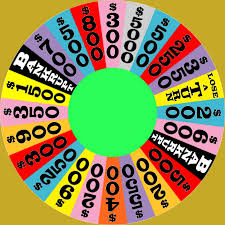 Currently it’s steel and plexiglass, weighing 2,400 pounds, according to Sony Pictures, who currently owns the production.