Tuesday, June 18, 2019

By any means necessary

Printing By Any Means was not an easy task. The prototypes were a digital breeze. Tried them on coated digital paper and Arches 88. The coverage was nice. Getting it to screen porperly was another story.

I was a silk screening lunatic once, going as far as pulling prints with a cigarette hanging out of my mouth (geez!). Decidedly reformed, the methods have transformed--some shops are water-based, others still print with oil-based inks but cure the prints in a 700-degree (371 C) conveyer kiln. Cleaning screens is no longer with liquid solvents, rather with solvent from an aerosol. Much better.
The blend just was't
working.

There are a number of screen printers scattered throughout Brooklyn and Queens, some in the Bronx. T-shirts are the favorite mode of expression, but the raw edge and large-size capacity make it great for all kinds of communication. The inks lend themselves to various opacities and while some don't like the thickness of the inks layered one on top of the other, that's one of the qualities I like about silkscreen. I never cared for a large edition of prints. I needed many proofs because I pushed the registration with fine lines. I'd only get 10-12 good ones and that's fine by me.

Which is why By Any Means needed to go through a number of file alterations before going to press. The first press requested AI files. I sent those, with PDFs of the two layers of text. I had advised that the X print as a blend, but the shop felt that it wouldn't work over such a large area (the X blends over a 20-inch (51 cm) span.

Yet another shop felt that screening the blend would work, but the dot screen ended up as a moiré and didn't work out.

However, digging a little deeper got me Kayrock Screenprinting's address. At the edge of where Newtown creek pierces Queens and Brooklyn, a huge brick building houses a number of industries, some relating to art making.

Kayrock is decidedly lefty; unafraid to say so on various printed material in the shop. They have handsome work they've printed from other clients; I am amazed at how different artists use the medium. I'll be posting some soon.

Just got this from the master printer at Kayrock Screenprinting in Greenpoint, Brooklyn, life is good.


Tuesday, June 11, 2019

Press Notes--"She has neither"

I've been thinking on why my entries to this blog are so spotty. Of course, media trends make blogging almost obsolete; records of one's progress are held on IG, as a running to-the-minute image diary, recorded by phone with a caption.

Going forward, I probably will abandon blogging, since my viewers just don't have the time or interest to read the tech notes and progress of this project. They'd prefer to see images and videos. A picture is worth 1,000 words.

However, there have been some twists in the printing. The image in the previous post, She has neither, is set for 3-D polymer plates and printed in Syracuse, NY by Boxcar Press. 

Totally patient individuals, my CSR informed me there were issues on several fronts. I'll post these separately. In one hit, I can picture people's eyes glazing over.

Press size. The press size, obviously, determines the paper, hence the size of the piece. Since I've been prototyping on a digital inkjet printer, the roll widths are 24" (61 cm). I've been putting Arches 88 through the machine, which has a width of 22" (56 cm). We'll talk about Arches later.

Offset sheets are larger, but can only take certain types of paper and have huge make-ready needs. DSH is a boutique piece, and, although funded, a consideration is what to do with all the material that is eventually printed. Another discussion.

Boxcar has an affectionate relationship with their equipment, lovingly displayed on their equipment page:


From the company's website. On its side it says "ZWEI
FARBEN", meaning two colors in German. I've always
worked in Heidelberg shops. They're great machines. 
Here's the info on the press that most likely will be printing my work:
press name: Heidelberg KSBAZ
press nickname: 2C-K
year built: 1973
serial number: KSBAZ345369
largest printable area: 16.5 x 21.375 inches
weight: 7,250 lbs.
why we (Boxcar) love this particular press: Dave C. (the pressman): It treats me right and keeps me out of trouble! We could all use a press like that. It prints like a Cadillac. No problems at all.

Friday, May 24, 2019

Sweet Home Alabama

Last week was a tough one.

While it's not surprising that Alabama's male congress would vote yes on the most restrictive abortion policy in the nation, effectively overturning RvW, it's a disgrace that the state's governor, a woman, signed the bill.

"She has neither". 15 x 22" 2-color
letterpress print from polymer plate.
I come from a life that respected the tenets of Catholicism. I practice weakly, but strive to be compassionate, understanding, charitable and helpful. Lots of things could have gotten me further in my everyday life that I just won't do. I'm no goody-two-shoes, but I don't hurt anyone. Not intentionally, anyway.

However, when it comes to a woman's right to choose, I have to go against what the Church wants for the rest of the nation and place myself firmly in the Pro-Choice category. Needing a procedure is a private and painful choice to make. It shouldn't be made more painful by people who don't know you or your circumstances.

A significant number of women who need the procedure are in fact mothers of families who do not have the ability to add another family member. And while insensitive anti-abortionists cruelly slap the term "inconvenience" to those having late-term abortions, no woman--none--enters that procedure without something very wrong going on with either her body or her child's.

The Pro-Choice/Pro-Life issue is one of female oppression. It's easy to call yourself "reformed" after two or more abortions and fight for others not to have one. Being Pro-Life is easy with social support and economic prosperity: If something doesn't go as planned, you can get what you need by going to another state--like New York--for a "theatre weekend". But, how about being Pro-Woman for a change, and allow women to choose what's safe for their bodies and their lives?


Friday, May 17, 2019

78 cents

All policy aside, it's a known fact all over the world that women get paid less than men for the same work--even if there is better performance. The percentage varies by country and culture, of course.

Sports, notably soccer, has gotten the most publicity since, while a winning team is a source of national pride, and investment has been made in the national soccer team, it's dwarfed by the investment made in the US men's team, as well as the salaries they receive.

According to the NYT's article March 9, 2019:

One of the biggest differences in compensation is the multimillion-dollar bonuses the teams receive for participating in the World Cup, but those bonuses — a pool of $400 million for 32 men’s teams versus $30 million for 24 women’s teams — are determined by FIFA, world soccer’s governing body, not U.S. Soccer.

however:

[Friday’s] legal action is the latest flash point in a years-long fight for pay equity and equal treatment by the national team, which has long chafed — first privately, but increasingly publicly — about the compensation, support and working conditions it receives while representing U.S. Soccer. The women’s players argue that they are required to play more games than the men’s team, that they win more of them, and yet still receive less pay from the federation.

Entering public academia where one's salary is listed on the internet, things got a lot easier. Having a union stick up for your salary rights helps, too. However, in the past, I've worked in places in which I was hired the same week as another colleague, handled accounts worth millions to his in-house assignment, and was paid--get this--$20,000 less than he was.

OK water under the bridge. But women are paid less in every way imaginable. Especially so with the working poor, whose salaries are held hostage against a life of hunger, homelessness, independence or just plain quality of life. And, we're a country in which a stay-at-home mom usually has a husband who earns well; most women need to work so their families survive. So, they're afraid to ask for a raise. They don't want to hear, like I did--in a multinational firm in Manhattan--"You're luck you have a job.

So, this in their homage:

78 cents, 16 x 16 in. (40.5 x 40.5) 4-color silkscreen

Wednesday, April 17, 2019

Malcolm X

My memories of Malcolm X date back to when I was a kid. I distinctly remember the photograph of him with his pointed finger, and his assassination quite a topic of conversation years after the event in the decidedly racist neighborhood in Queens where I grew up.

I'd read bits and pieces of his autobiography over the years, but only recently in one hit, oddly, on a plane to Bogotá this January. The Times, in its review back then had called it a painful book, and it was. The stories are well known, and I'm not going into them here. Except one.

Something I found resonated with me: the passage where he described a time when he was in a foster home with a white family. He described social workers, neighbors and others coming over to view how he was getting along--as if this could be measured--in the foreign environment to which he had be relegated.

What struck me was that he, his situation and his details about his daily life were discussed and dissected plainly in front of him, without the first consideration that he participate or be included in the conversation, or that he had any understanding--or the ability to understand what was being said about him. He observed and felt that he was treated like a piece of property, like a piece of real estate or a farm animal.

By Any Means, digital typographic com-
position, 22 x 30 inches 56 x 76 cm.
I don't know if that's how all children were treated at the time, or if adults in that part of the US behave differently toward kids than liberals in Manhattan, but it resonated with me because I've seen this time and again with different individuals. The elderly, women, the differently-abled, foreigners, the poor. They're treated like specimens, in the worst sense of the word.

Making yourself prominent and respected on the most basic level of consideration, needs to be the springboard for any type of equality. That level of consideration could be quite complex, even at if it is elementary, and the exercise to explore, much less understand that consideration is a process that occurs over a period of time, on various levels and in an expanding network of ideas, cultural knowledge and historical facts.

Simply put, you don't wake up one day and understand "diversity". You don't get over "separate but equal" over night. We've been working on it for over a century and usually fail with a few pockets of success. However, what I find disheartening is when I see people who really ought to know better and have a sense of understanding and compassion, fall into what their insular circles have taught--and reinforced--over their lives. To the point that there isn't a chisel sharp enough or hard enough to break through the ice.

The piece shown was composed in AI and a number of design considerations were made to make the text readable. It's planned as a silkscreen, printed over the next few weeks.

Tuesday, April 16, 2019

Life Getting in the Way of Life

Very, very much time has passed without my writing, but that doesn't mean that I've set the project aside. Quite the opposite. The project has taken many new directions, and my research into print methods has been a journey that at once includes discovery and mourning as well.

It's almost impossible to get anything printed offset, unless, of course, you're a newspaper or magazine making thousands of impressions; the way to go nowadays is the INDIGO, which, out about ten years now, has pretty much replaced offset for anything other than web press applications (For those who don't know the term web press, it has nothing to do with the internet. It's a huge printing press, with six or more colors, and the capability to print both sides of a sheet in a single pass. The paper comes off huge rolls which are stored either at the press or a separate warehouse where the temperature is controlled. The printed sheets then go through a folding stage, and then brought by a conveyer belt to its end where it's made ready to bind. It's not the kind of press you can have in your garage).

Small runs of offset are non-existent. Funny, I used to be a quality control foreman in an offset printing plant, one of the few in Long Island City. We had some big perfecting sheet-fed perfecting presses but also, a little gem of a four-color mini-press, which I was hoping to find to print one of the pieces. To no avail. A few short years and this print method is dead, buried, dust.

The design work, however, has been ongoing--material being produced weekly from the goings on in Washington and all its ramifications. There are very disturbing trends that merit exposure, but the work must get out immediately. Like a printed periodical (ha!), if it doesn't get out, it's stale, old, and, as we've discovered by this administration, immediately supplanted by a new barrage of plainly weird news.


I wrote the copy for the piece above; sent it out to print digitally on Arches 88. Looks great. I might edition it and offer it for sale.

Additional posts coming this week, as a lot of the research is finally coming to fruition.

Tuesday, January 15, 2019

Rolex and the Wheel of Fortune

Has a nice ring to it, huh?

Both entities use Clarendon as their brand font. What's most interesting about Clarendon is that it can take on a circus quality (it's so thick and chummy) or it can have stability and command.

According to the site logorealm.com:

"Featuring a somewhat modified version of the Garamond typeface, the font in which the Rolex watches logo is written has gone through a few minor changes. These are mostly related to the serifs present in the font, as they have undergone several very minor changes over the course of logo’s existence."

Ex-cuse me!


Clarendon has NOTHING Garamond about it. The "changes related to the serifs" is a joke of a comment. Have a look at a Garamond R and the Clarendon R. 


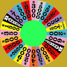
The history of the wheel in the Wheel of Fortune is readily available on the Internet. However, what is interesting is that originally the wheel, designed by art director and Broadway set designer Edwin Flesh (1931-2011) was made of cardboard and lights. He brought lights and sound to the US TV game show; previous to that, the announcer used suspense like “what do you think is in this box?” But nothing more. 

Currently it’s steel and plexiglass, weighing 2,400 pounds, according to Sony Pictures, who currently owns the production.